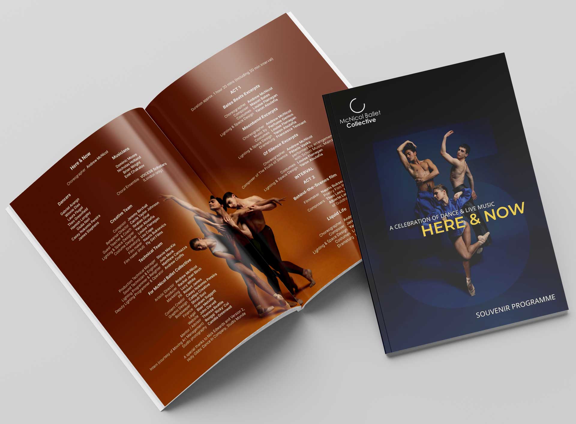
Case study:
Dance Umbrella Festival
Rethinking the festival programme to give every artist equal billing.
Redesigning Dance Umbrella's printed programme to cut costs, fix a racking problem and give every artist equal space, without losing what made it special.
The situation
Dance Umbrella is one of London's most important dance festivals, now in its 47th year. Every October, it programmes international artists across venues from the Barbican and Sadler's Wells to Brixton House and the Unicorn Theatre.
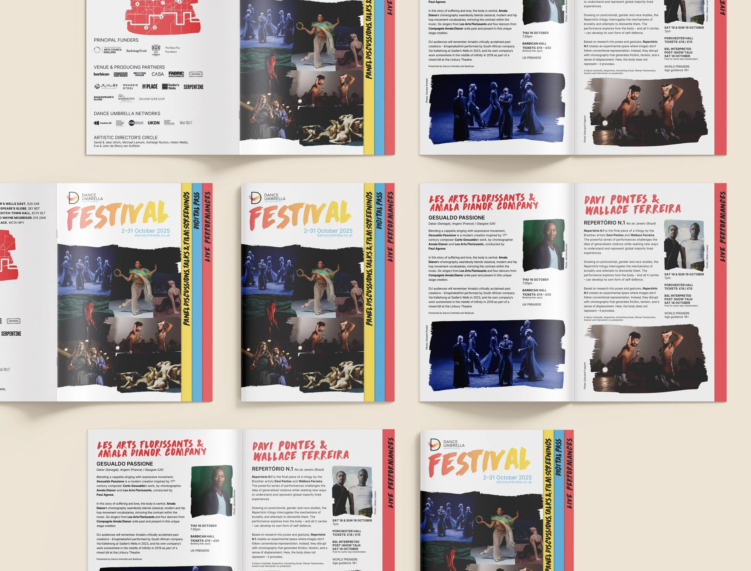
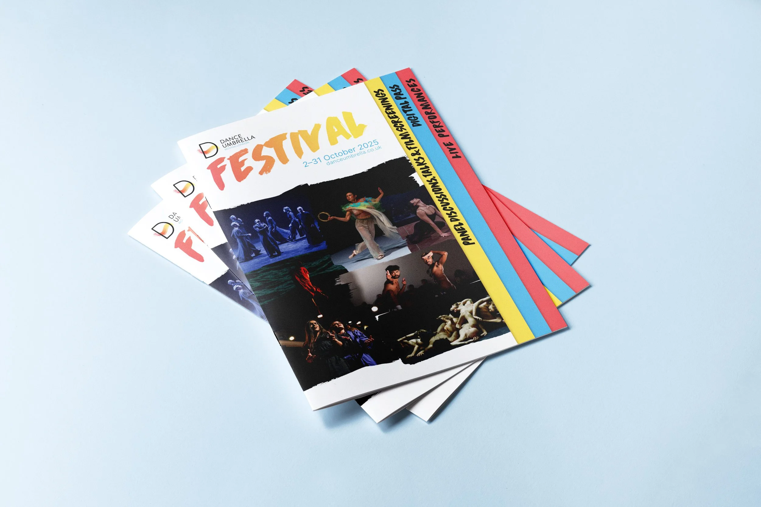
For the previous three years, the festival programme had been a die-cut concertina in a DL format. It was a striking physical object, but it had real problems. The die-cut format was expensive to print. When racked in venue foyers, the logo and key text disappeared behind the rack lip. And the concertina layout gave more visual real estate to some artists than others, which didn't sit well with a festival that values the multiplicity of voices in its programme.
I came to the project through my wife, who was freelancing as Dance Umbrella's marketer. We often work together on projects, with her handling marketing strategy and me on design. It's a combination that means the design is always informed by how it will actually be used in the campaign, not just how it looks on a mood board.
The brief
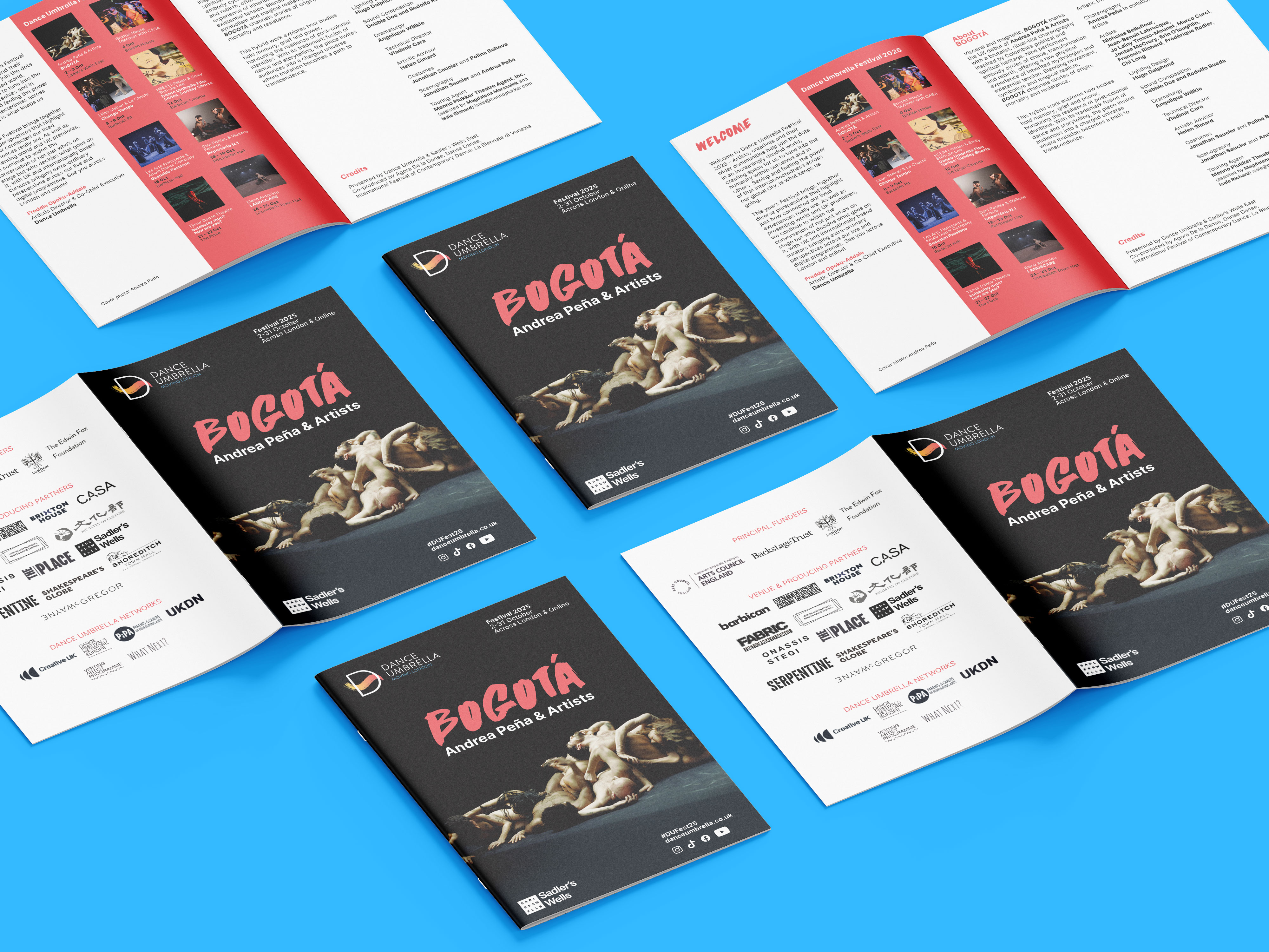
Dance Umbrella's brief was clear about what needed to change: reduce printing costs, make it rackable, and give more equal space to each artist. They were open to format suggestions but leaning towards a standard A5 or DL booklet.
They also wanted to keep all artists visible from the cover if possible, something the concertina had attempted with its diagonal image strips but hadn't quite achieved fairly.
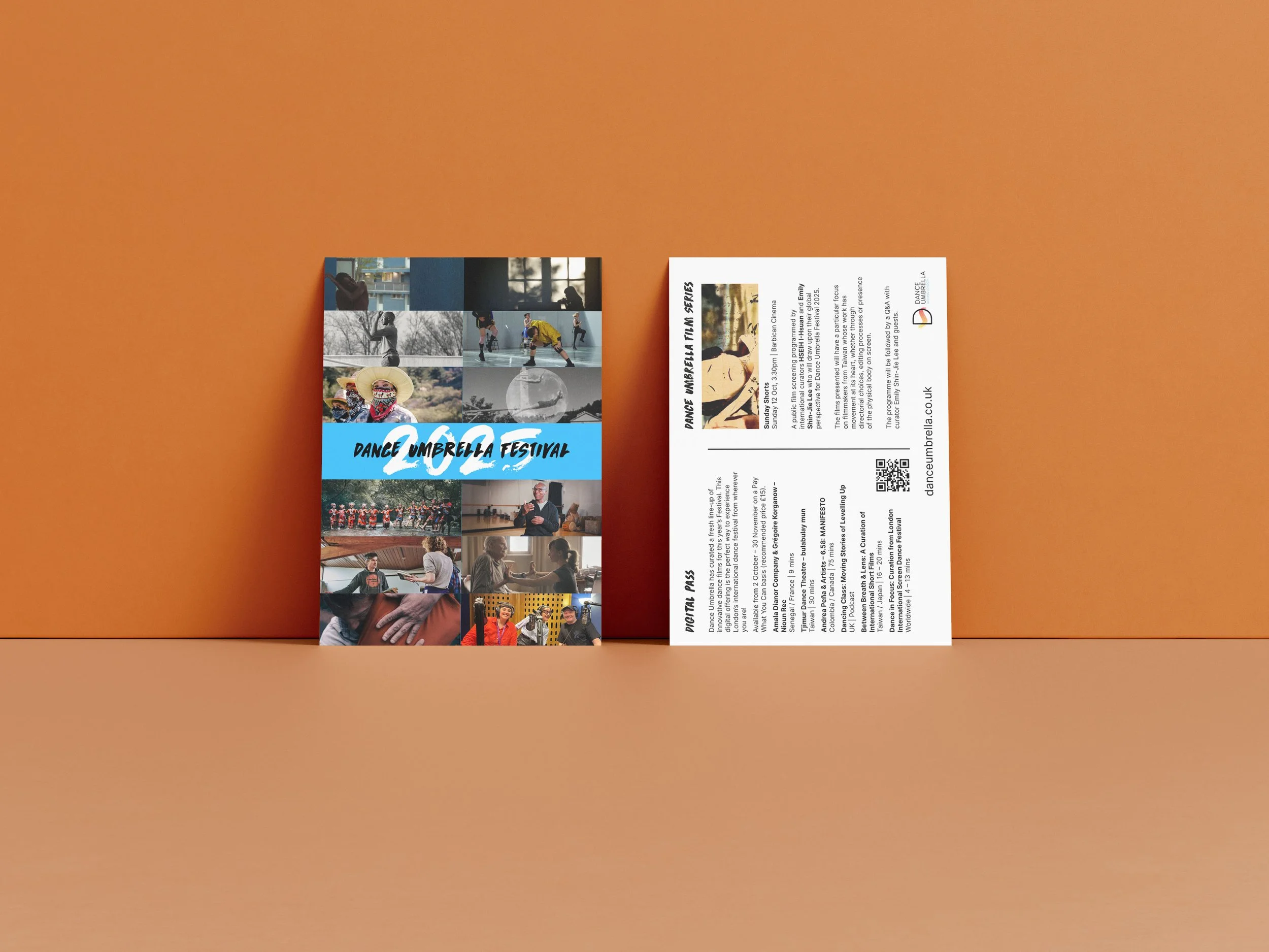
Each live show needed its own page with copy, dates, venue, ticket prices, accessibility information, production images, artist headshots and show-specific funding credits. The digital programme, previously treated as an afterthought listing, needed to become more visual. And there had to be space for an introduction from the artistic director, a calendar of events, funder logos and fundraising messaging.
The thinking
The key constraint was fairness. A standard booklet would technically give each artist a page, but the front pages always get more attention than the back. I wanted something that made every section immediately visible and accessible, not buried in a reading order.
The solution was a tabbed A5 programme. Each section has a visible tab at the edge, so when you pick it up you can see all the content areas at once and go straight to what interests you. The performance pages become the first content you turn to, despite being preceded by introductory material. Every artist gets a full page with equal prominence.
I explored different numbers of tabs, but the content drove that decision. The programme needed to accommodate the live shows, the digital programme, the calendar and the front matter, and the tab divisions fell naturally out of how the content was structured.
When I presented the first mockup to the Dance Umbrella team, they liked it enough that I didn't need to develop alternatives. That's not always how it goes, but when the solution is clearly right for the problem, it's better to refine than to hedge with options for the sake of it.
What was delivered
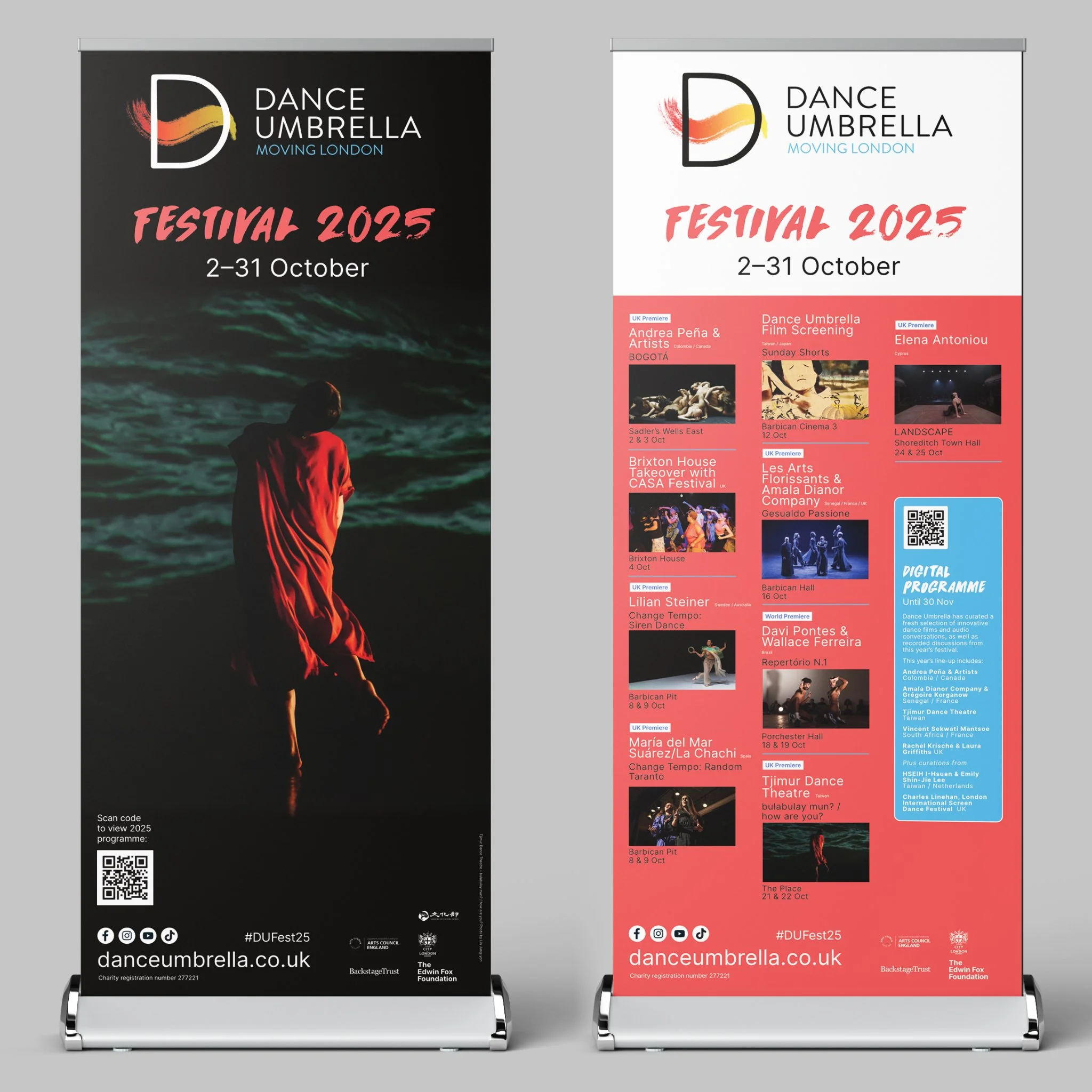
Tabbed A5 festival programme with custom die-cut tabs. Animated version of the Dance Umbrella logo. On-site signage for each venue. Individual venue programmes. Posters, leaflets and postcards for marketing. Artworking for apparel and merchandise. Pull-up banners and environmental graphics.
What changed
The new format cost less to print than the concertina. It racks properly, with the logo and festival dates visible. Every artist has equal space. And the tabs give the whole thing a sense of structure and navigability that the concertina lacked.
It also works as the international calling card that Dance Umbrella's artistic director takes to festivals abroad: a confident, well-made object that represents the breadth and ambition of the programme without privileging any single artist over another.
Photo: credit Foteini Christofilopoulou
Services provided
Deliverables
Client