Case study:
Museums + Heritage
Unifying three brands under one identity system, from logo to Canva template.
A four-year relationship that grew from campaign design into a complete rebrand, unifying the M+H Show, Awards and Advisor under one flexible identity system.
The situation
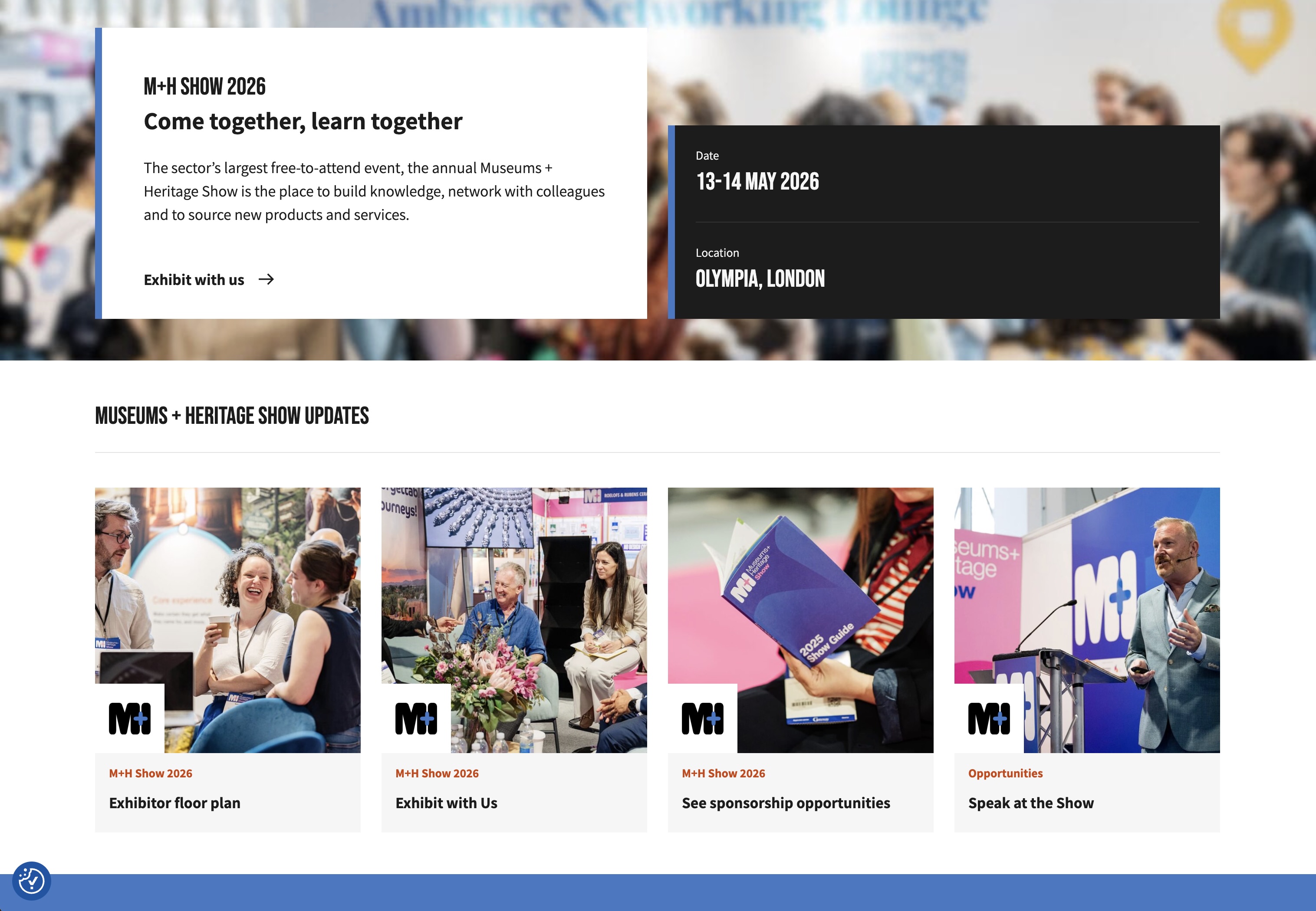
Museums + Heritage is one of the most recognised names in the UK cultural sector. It runs three distinct products: the M+H Show (a free annual trade event), the M+H Awards (a ticketed ceremony celebrating the best people and projects in the sector) and M+H Advisor (an online news magazine that connects the sector year-round).
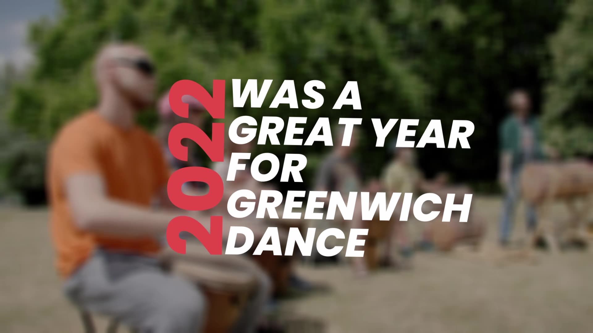
When I started working with M+H in late 2021, the brief was straightforward: design the campaign materials for the 2022 Show. Bold colours, graphic typography, key information. A standard campaign job.
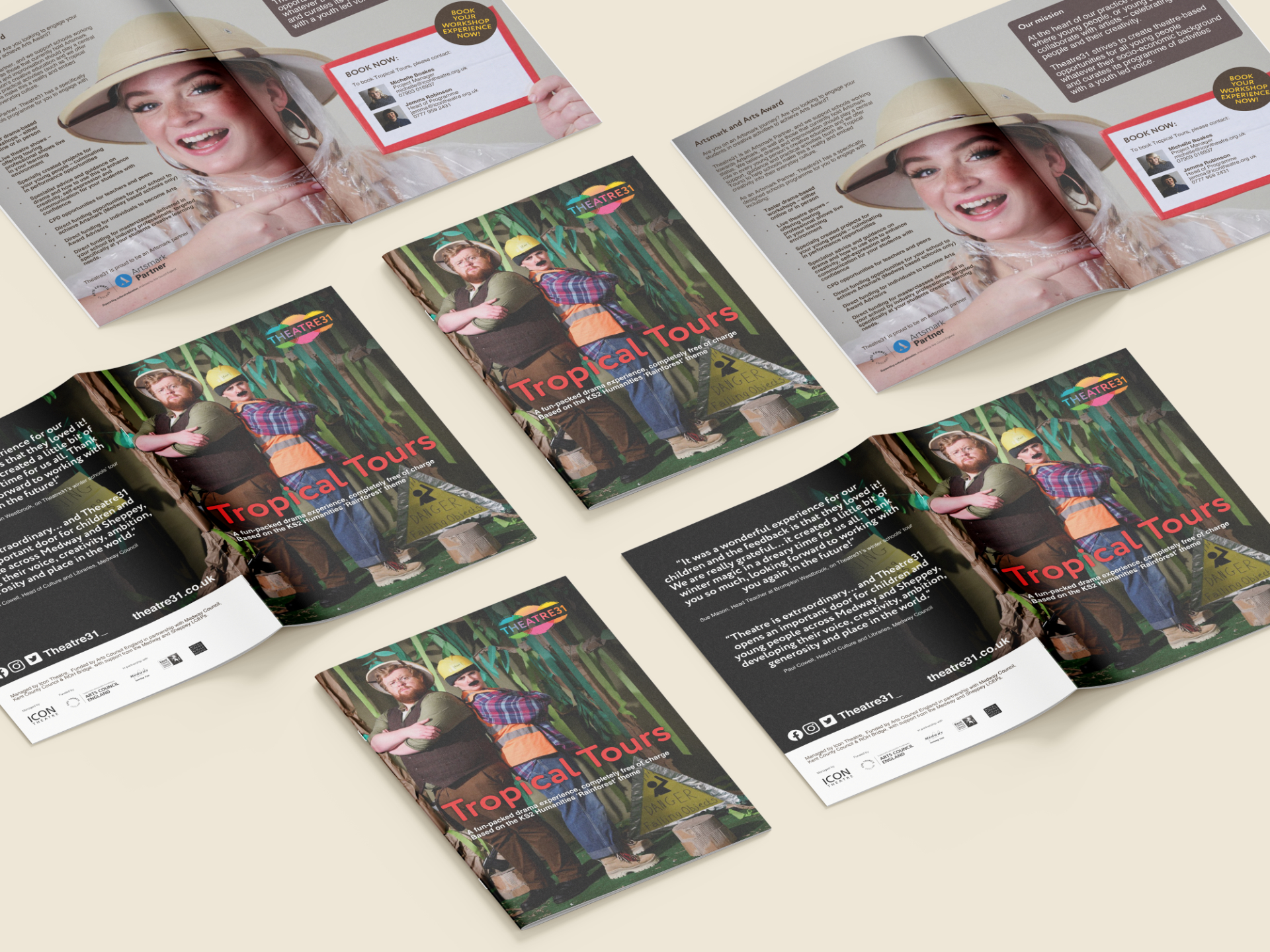
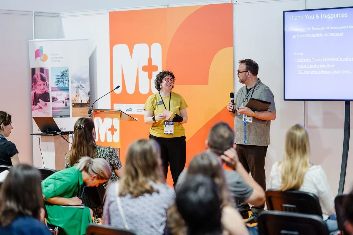
But the relationship grew. Over the following years, I designed campaigns for each year's Show and Awards, produced exhibition graphics, stage sets, brochures, maps, signage, motion graphics and 3D renders. As the work expanded, a bigger problem became visible: the three M+H brands had grown up separately and no longer worked well together. Each had its own logo, its own visual language, its own way of doing things. The suite had become unwieldy, and the team were struggling to maintain consistency across an increasing range of channels and outputs.
The thinking
The campaign work came first, and it set the tone for everything that followed. Before producing any concepts, I mapped the competitive environment: what comparable conferences and trade events in the museums and heritage sector looked like. The findings were striking. Most used abstract graphics, most were extremely simple, and almost nobody used colour to differentiate themes or content streams. That gap became the starting point.
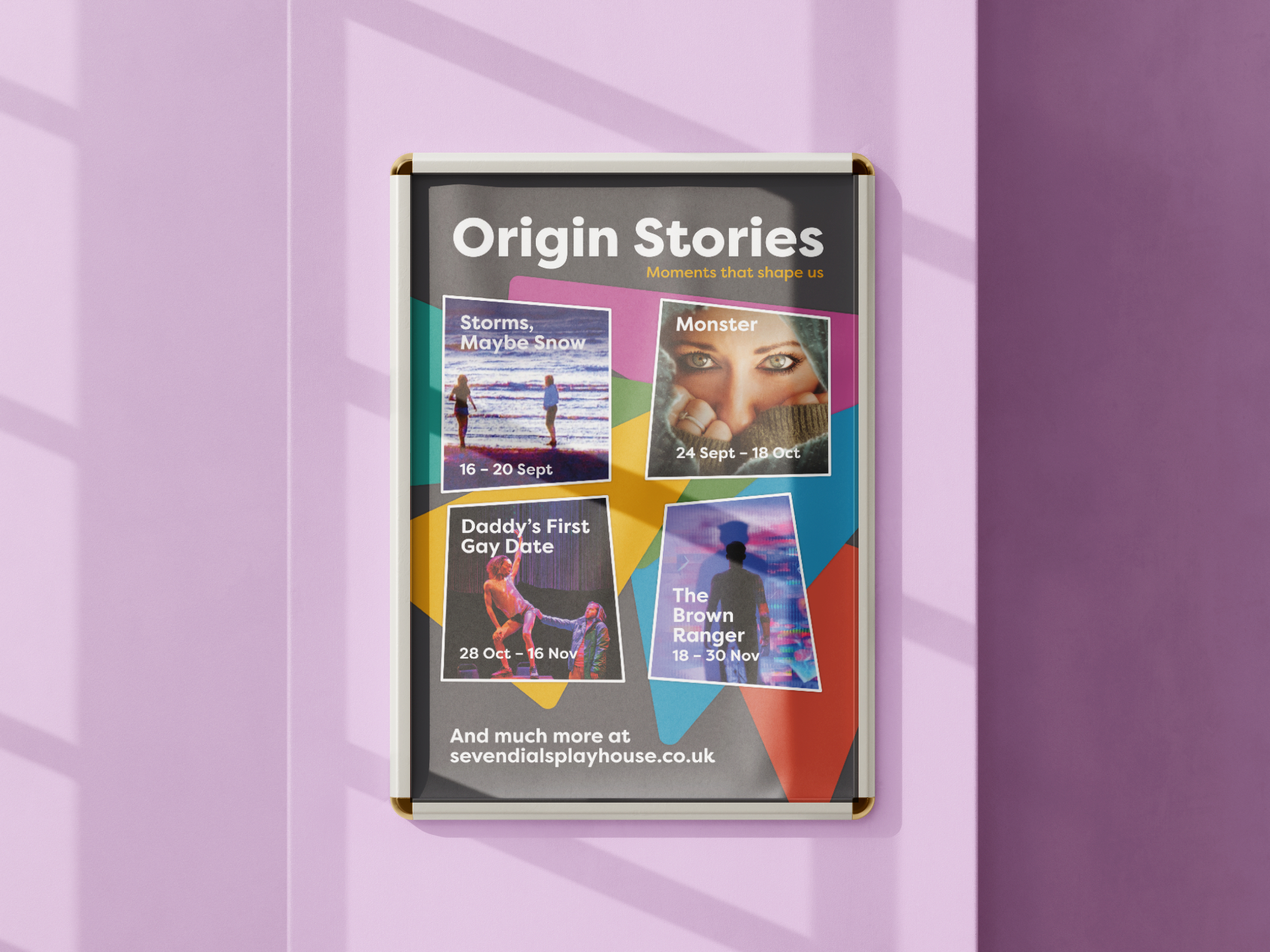
For the initial Show campaign, I developed over eight distinct creative directions, each with a clear rationale: from Swiss-influenced graphic typography through to public domain imagery from 'The Human Soul' (an 1838 book of photography), Festival of Britain-inspired woodblock textiles, colour powder photography, paper cutout collage, and bold flat colour. Each concept was presented with environment research, application mockups across social, exhibition graphics and signage, and a written explanation of the thinking behind it. The visual system that emerged worked in colour to differentiate content types, something their competitors in the sector weren't doing.
Critically, the Awards campaign was designed from the start with 'Editable in Canva' listed as a core requirement alongside 'flexible', 'easy to position elements' and 'allow for different colour versions'. Internal usability wasn't an afterthought. It was a design constraint from day one.
By 2024, M+H's director was ready for a proper rebrand. The original brief was clear: the logo suite isn't working, let's look at what's strong and build on it.
The logo exploration was extensive. I produced well over a hundred concepts, from abstract symbols and monograms through to refined typographic treatments. I identified what M+H already owned in people's minds. The plus sign was the most distinctive element: a simple symbol that carried real meaning in a sector built on connection and collaboration. It would have been a mistake to lose it. The square format of the existing logo also had recognition value. Those were the foundations.
For the logotype, I drew on a digitised 1838 woodcut typeface, refining it into something slimmer and more contemporary that felt both rooted and modern. The M and H are conjoined, representing unity in the sector. The plus sign sits between them, now able to work in colour to distinguish the three sub-brands or in negative space to suggest the broader value M+H brings beyond its core products.
The three brands each got their own colour: blue for the Show (calm, professional, open), pink for the Awards (celebratory, distinctive) and orange for the Advisor (confident, editorial). Three voices, one family.
This wasn't a straightforward process. After extensive exploration, there were moments where the brief drifted: from 'let's be bold' towards 'let's find something everyone's comfortable with'. Part of my role was to keep pulling the conversation back to the original questions: why are we changing? Do the new logos address that? Do the gains outweigh the losses? Sometimes being a useful designer means being the person who says 'I think we're solving the wrong problem now'.
The practical bit
One of the most important parts of this project isn't visible in the portfolio images. Both the logo and the plus symbol were developed into bespoke Canva frames, giving the M+H team an easy, consistent way to create on-brand social posts, slides and signage without needing to come back to me for every piece. The identity system was designed to be used, not just admired.
The system now works across everything from large-scale exhibition graphics and stage sets to everyday email headers and social templates. It flexes without breaking.
What was delivered
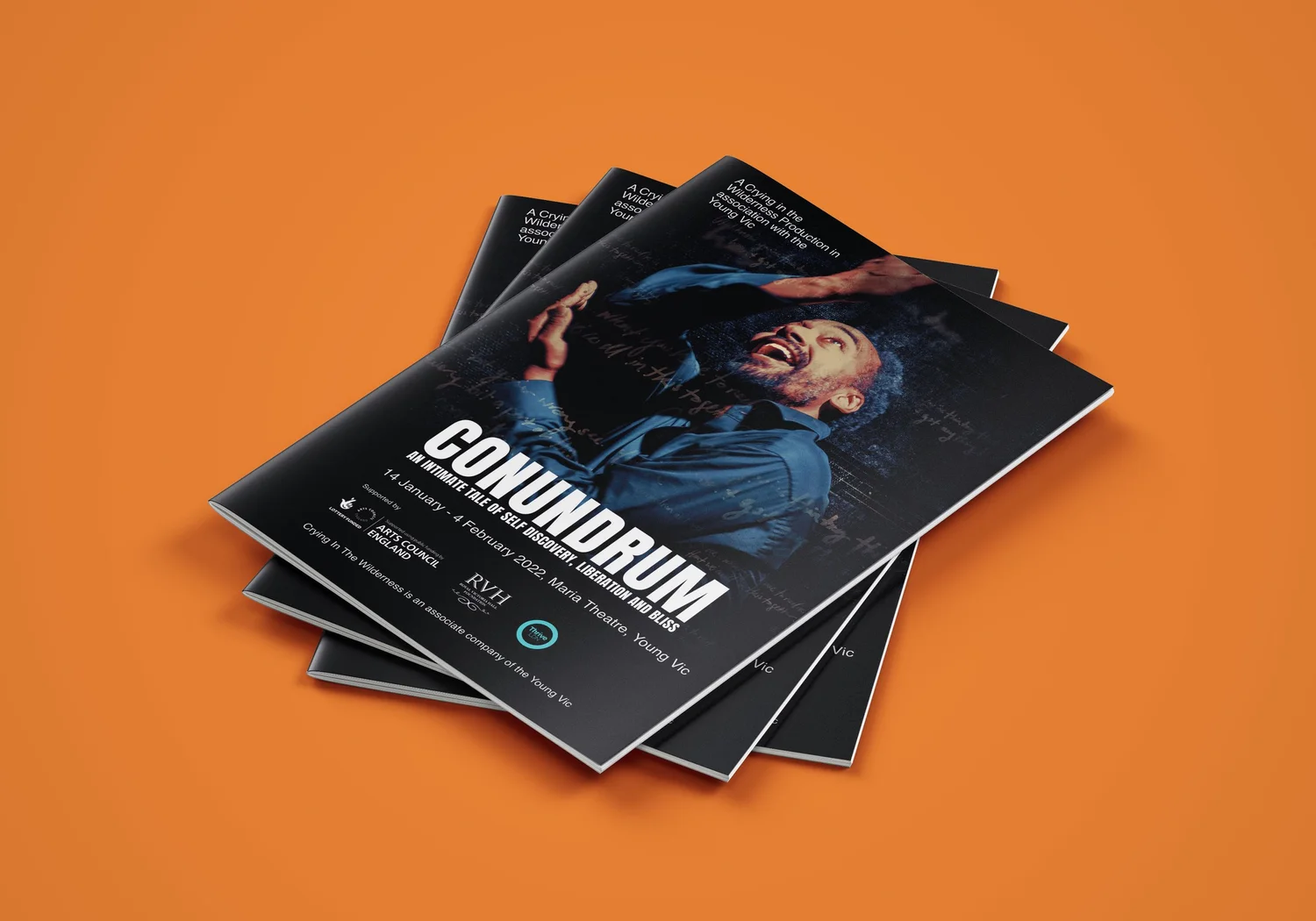
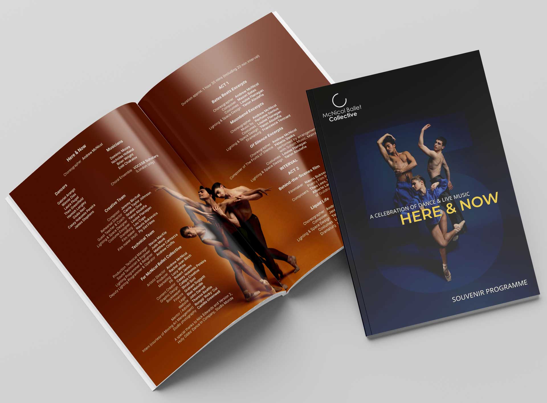
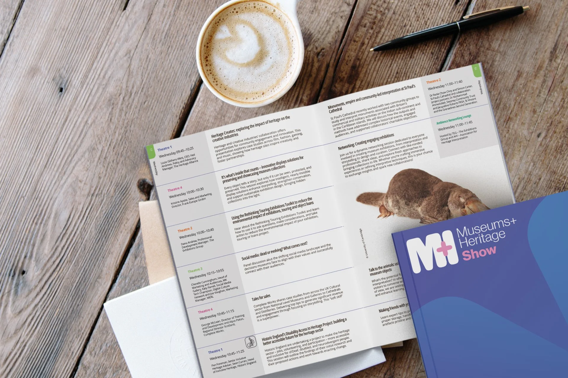
Brand identity system including new logo, sub-brand variations and guidelines. Campaign design for the annual Show and Awards. Exhibition graphics, stage sets and environmental signage. Brochures, maps, programmes and show guides. Motion graphics and 3D renders. Bespoke Canva frames and templates for internal use.
The relationship
This project didn't start as a rebrand. It started as a campaign commission in 2021 and grew into something much bigger because the working relationship worked. That's how most of my best projects happen: a small piece of work builds trust, the conversation deepens, and eventually the client brings the problems they've been sitting on for years.
I've now worked with M+H across four years and counting.
Photos: Hayley Bray Photography


Services provided
Deliverables
Client